Spend enough time in investment reviews, planning meetings, or client presentations and a pattern starts to emerge.
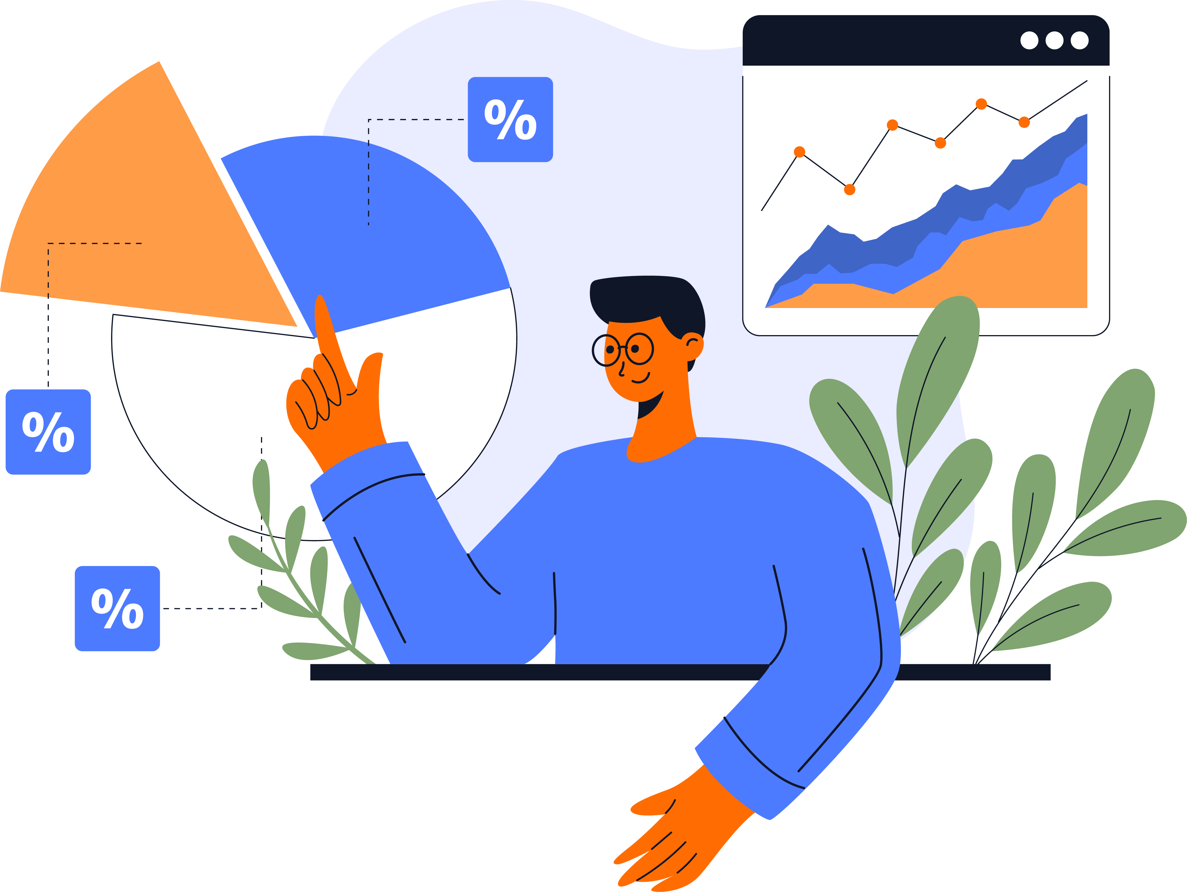
Someone opens a dashboard. A return figure appears on the screen. A chart shows a trend. A projection extends decades into the future. A score summarizes something complex into a single number.
Everyone looks at it for a few seconds. Then the questions begin.
Why did the portfolio perform this way? What changed compared to last quarter? Why does the projection drop at that point? What contributed most to this score?
These questions are not signs that the dashboard failed. In many cases, the dashboard did exactly what it was designed to do. It presented the result clearly and efficiently.
The interesting part is what happens next. The conversation almost immediately moves beyond the number itself and toward the chain of events, assumptions, decisions, and calculations behind it. People are rarely interested in a figure in isolation. They want to understand what produced it and whether it deserves their attention.
That is where a surprising amount of work still takes place.
Think about what typically happens after one of those questions is asked.
An advisor opens another screen to look at attribution data. An analyst pulls up transactions from the period. A planner reviews assumptions inside a financial model. Someone exports a report, filters a table, or opens a spreadsheet.
None of this is unusual. In fact, most firms have built entire workflows around the process.
The explanation usually exists somewhere inside the system. The challenge is that users often need to reconstruct it themselves. They move from output to output, connecting pieces of information until a coherent story begins to emerge.
For experienced professionals this process becomes second nature. They know where to look and how to interpret what they find.
For clients, newer team members, and occasional users, the experience can feel very different. They see a result and then watch a series of investigative steps unfold before anyone feels comfortable explaining it.
The dashboard provides the starting point. The explanation is assembled afterward.
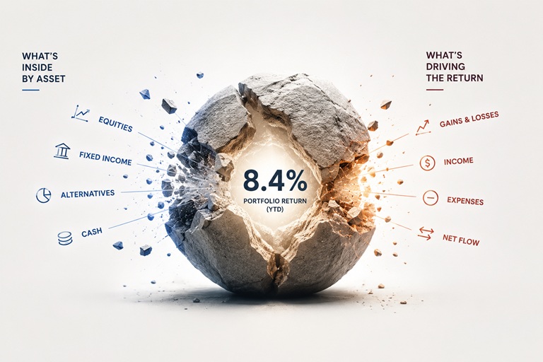
Imagine selecting a portfolio return and seeing the factors that had the greatest influence on the result.
Not another report. Not a methodology document. Not a training guide.
Just a clear explanation attached to the figure itself.
A user clicks on a projected retirement shortfall and immediately sees which assumptions contributed most to the outcome. A profitability score reveals the components behind the calculation and how each one affected the final result. A concentration warning shows the positions, exposures, or relationships that triggered it.
The goal is not to expose every calculation ever performed by the system. Most users do not want that level of detail.
What they want is the same thing they ask for during meetings: context.
They want enough information to understand what they are looking at and decide whether they need to investigate further. That difference may sound small, but it changes the relationship between the user and the report.
Reporting software has traditionally focused on helping users find information.
Over time, vendors built more dashboards, more filters, more visualizations, and more ways to organize data. Those improvements were useful because information itself was often difficult to access.
Many organizations can now surface almost any metric they need within seconds. The effort often begins after the metric has been found.
Teams spend time understanding why something happened, deciding whether it matters, and determining what should happen next.
This is one reason conversational interfaces and AI-driven analysis are becoming more relevant. They address a part of the workflow that has remained largely unchanged for years.
People naturally ask questions when they see data. Technology is becoming capable of responding within the same context where those questions arise.
The dashboard no longer needs to act solely as a display layer. It can participate in the process of interpretation.
The most interesting aspect of this shift has very little to do with technology itself.
It has more to do with reducing the small delays that appear whenever a user needs to move from the number on the screen to the explanation behind it.
Every additional screen, report, export, calculation, or investigation adds another step to that process. Individually, those steps may seem minor. In practice, they shape how people experience information.
A dashboard that can explain a return, justify a score, describe a projection, or clarify an alert keeps the user focused on the question being asked. It removes some of the work involved in searching for the pieces needed to answer it.
That may be where reporting gradually evolves next. Toward systems that help users understand what they are already looking at.
Because in most meetings, the number on the screen is only the beginning of the discussion. The real value comes from everything people want to know once they have seen it.