When working with multi-generation families, the first topic is never the portfolio itself – it is the structure behind it. Understanding who participates in decisions, who owns which assets, how entities are organized, and how responsibilities shift across generations is essential before talking about allocation, liquidity, or planning. This layer serves as the base for everything that comes later: risk discussions, governance rules, estate planning, and even day-to-day interactions within the family.
Today, most family offices still rely on classic tools to represent this structure: a family tree saved in a PDF, a diagram of companies prepared by a lawyer, or a few spreadsheets showing who owns what. These materials work for simple cases, but they do not adapt well when the family becomes more global or when new companies, trusts, or vehicles are created over time. The structure may evolve every year, while the diagrams stay the same. Advisors end up explaining the differences verbally, because the documents do not keep up with reality and quickly become outdated.
A structure is not just a list of names or entities – it influences how wealth moves, who participates in decisions, and how each generation interacts with the assets. When this layer is static or unclear, it becomes harder to make informed decisions and to align expectations across the family. Clear structure leads to better planning, smoother succession, and more effective communication between advisors and families. That is why having a living, updated view of this architecture matters so much.
Most wealth platforms were built around the idea of separating topics: one section for family profiles, another for company ownership, another for portfolios, another for compliance. Each module works well on its own, but they rarely talk to each other in a way that helps the advisor understand the whole picture at once. When information is split like this, the advisor is forced to mentally combine it, jumping between screens to see how people, entities, and assets connect in practice.
This becomes even more challenging when the family structure has multiple layers. Imagine a parent owning a holding, that holding owning another holding, which in turn owns an operating company used by several family members. If each piece of data sits in a different part of the system, the advisor needs to navigate back and forth to rebuild the story manually. It is not that the information is wrong – it is simply not presented in a way that matches the level of complexity that modern families deal with on a daily basis.
Another limitation is that traditional diagrams tend to simplify too much. They show percentages and lines, but they do not explain how those numbers relate to the family’s financial reality. If a holding has most of its value coming from one asset, a static diagram will not highlight this clearly. If there is indirect ownership through multiple companies, the diagram will not make that intuitive. Advisors end up relying on long explanations instead of visuals that speak for themselves. In everyday work, this slows down analysis, increases the risk of misunderstandings, and forces conversations to depend heavily on manual interpretation.
A graph changes the way this information is consumed because it presents people, entities, and ownership in a single connected environment. Instead of opening multiple screens, the advisor sees one map where everything is linked. If the user clicks on a person, they see the entities connected to them. If they click on a holding, they see the layers beneath it. If they zoom out, they see the entire family in one clear view. This reduces mental effort and makes the structure easier to understand even for those who are not used to dealing with complex diagrams.
The major advantage is that a graph adapts naturally as things change. When a new company is added, it fits into the network. When someone increases participation in a vehicle, the link updates. When the family grows or responsibilities shift, the map remains coherent. Instead of a static diagram that becomes outdated quickly, the graph evolves with the data itself and keeps the structure aligned with reality, without extra manual work.
It also helps in discussions. Families understand visuals better than lists, and advisors can show connections instead of describing them. For example, showing how one holding affects the value of another, or how ownership flows through two or three layers, becomes a matter of one click instead of a long explanation. When the structure is cleaner and easier to explore, planning becomes more objective – whether the topic is governance, succession, diversification, or risk concentration. The same information exists, but it is presented in a way that supports better decisions.
In Pivolt this idea takes the form of a widget that brings family relationships, ownership, and portfolio data into one place. Each node represents a person or an entity, and the connections between them show how everything fits together. You can expand a holding to see what it owns, collapse sections to simplify the view, and follow ownership percentages across layers. The visual layout makes it easier to navigate complex structures without losing the overall context.
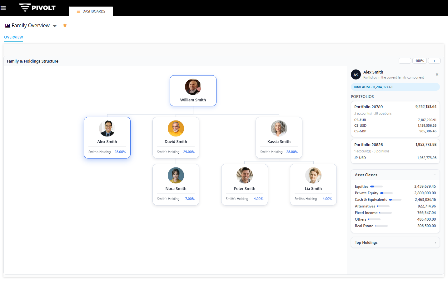
The widget also links directly to the financial side. When you click on an entity, you immediately see the asset classes connected to it. And if you want to go deeper, you can open the list of underlying positions, bringing any relevant information to a particular context. This means structure and wealth are no longer two separate topics; they appear naturally together, just like they do in real life. The advisor does not need to switch modules to explain how a company, a person, and a portfolio relate to each other.
For advisors, this becomes a working tool instead of a static diagram. It helps in conversations about succession, governance, concentration risk, liquidity events, and long-term planning. They can show scenarios, discuss potential changes, and highlight important points directly on screen. Families also understand their situation faster, because everything is shown in a simple, visual way, without needing to interpret technical diagrams or long documents.
What makes this type of visualization useful in real life is that everything stays connected automatically. When a new holding is created, it appears in the structure. When a family member becomes involved in a company, the link shows up. When portfolios change, the values attached to each person or entity update without any manual effort. There is no need to maintain separate diagrams, fix broken PDFs, or explain changes verbally every time something moves – the system simply reflects what is happening.
For advisors, this removes a lot of friction from everyday work. Instead of switching between modules or trying to reconcile information across multiple screens, they see the full picture in one place. It becomes easier to discuss planning, highlight risks, explain how assets are organized, and help the family understand where the main responsibilities or concentrations sit. The conversations become clearer because the information is presented in a way that anyone can follow, regardless of their technical background.
For the families, the benefit is straightforward: they finally see their structure in a way that makes sense, even when it is complex. They understand how people, companies, and assets connect, and they feel more confident in the decisions being discussed. A clean visual map reduces confusion, avoids misunderstandings, and supports smoother conversations between generations, especially when sensitive topics like succession or governance are on the table.
This is the goal: turning complex information into something simple, updated, and useful. A tool that supports advisors, helps families stay aligned, and brings more clarity to topics that normally feel difficult to explain. In a modern family office, this kind of transparency makes a real difference and becomes a natural part of how structure and wealth are managed over time.